This article deals with the card layout and parameters used in Z/X -Zillions of enemy X- TCG, which has gone several changes and having several variants as well.
Original Layout[]

|
This was the original layout used for the cards, starting from Free Set 1-1: Crimson Hero & Jet-Black Devil and last until Free Set 13: Flame-Blooded Serpent King & Sonata of Waves.
The frames used on cards are colored in accordance with the cards' color, with yellow and purple being used for White and Black, respectively. The frames also had additional flourishes on both the bottom left and bottom right side of the card that depends on the color (blood/magma-like flows for Red, gears for Blue, cursive and "pillar" of lights for White, chains and skulls for Black, vines for Green), with the flourish on the bottom right side of Z/X cards being taller that the ones on Event card. Colorless and Player cards (with the exception of Player cards with stylized frames) use gray as their frame's color, without any additional flourish being added to the frame layout. The entire illustration of cards are located within the frame layout.
The card's type, Cost, and color of a card are positioned on the top left side of the card in that order from top to bottom. All five possible colors are present on the card frames, with unused colors shown as silhouettes on the cards. However, the silhouettes are removed on Hologram Super Rare and higher rarity cards starting from Booster 2: Roar of the Titans. Player cards, which have no Cost, have their color icon placed on the space where the Cost normally is, with all the color icons below it shown as silhouettes. Colorless Player cards use the Ignition Icon in place of the color icon instead.
The card's name and text box (containing the text, Power, and flavor) are located on the bottom half of the card, with a black background for the name and a translucent gray background for the text box. A black bar is placed under the text box where the Tribe, rarity, and collector number of the card are located, with the left side often slightly pushed by the text box part that contains the Power. On Hologram Super Rare and higher rarity cards, the name is usually placed in various different positions relative to the illustration, using a different font which is different for each color. Also, the text box background on Hologram Super Rare and higher rarity cards is removed, and the contents are often pushed to the bottom to show more parts of the illustration.
")
")
")
")
")
")
")
")
")
")
")
")
")
")
")
")
")
")
")
")
")
")
Set 13 Layout[]

This was the layout that was introduced and used starting from Booster 13: Wind of Change until Extra Pack 26: Start☆Festival!!.
The frame is more standardized between colors in this layout, with the flourishes now being removed from the frame layout except on holographic higher rarity cards. The colors used in the frame also appear to be brighter compared to the original frame layout due to the additional highlights in the frame. Player cards still use the gray color frame, but now have highlights of their color across the frame itself. While the majority of colored cards stick to the gray color frame, some of them also started using a rainbow-colored and/or magenta frame, especially on high-rarity cards.
The overall layout of the frame is mostly the same as the original frame layout. However, the color is now moved to the top right side of the card, the Power is now given its own box in the frame, and both Tribe, rarity, and collector number of the card are now located in the frame itself as opposed to their own box. Both rarity and collector number are also given a lighter background in the frame, with the rarity "indicator bar" now aligned on the top of them. Colorless cards now properly use the gray circle icon in the place of their color. However, some colorless cards (especially Player cards) still use various other icons instead of the gray circle icon.
Z/X Extra cards are introduced in Booster 16: Code:Dingir - Encounter with Dynamis, and bring several additions and changes to the card layout. The text of a card is now restructured with various icons to properly differentiate the different parts of an ability, with additional icons to define the ability range added in Booster 32: Code:Dreamworld - Dreamclad "Idealize". Cards with multiple colors are also introduced, with their frame having all of their colors which gradates from one color to another (or simply using the colorless frame for several 5-color cards).
Various Tribe introduced since then saw the addition of various flourishes in the card frames:
- Dingir has the Dingir icon under the Cost and the name of the featured character written horizontally in Dingir characters on the right side of the card, in addition to various flourishes reminiscent of cuneiform.
- Waker has the Waker icon under the Cost and two symmetrical stylized dragons flanking the text box, with various stars adorning the card frame layout.
- Cthulhu has the name of the featured character written horizontally in a reversed-and-heavily-stylized cursive font on the right side of the card, in addition to various flourishes reminiscent of their namesake.
- Idealize has a card frame layout reminiscent of both the Waker and Cthulhu, with various four-pointed stars, arrows, and keyholes adorning the cards.
- Curator has an icon consisting of a stylized Rutherford atom model contained inside a laboratory flask under the Cost.
Other card types introduced during the usage of this layout mostly keeps to the overall layout, but having their own stylized or slightly distinct frames.
- Z/X Overboost, being split into 2 cards, had their parameters split across both halves, with the name written in various positions on both halves in addition to an English name written across both halves. Their text box is located on the bottom half and positioned slightly diagonally, with the Power located on the right side instead of the left side of the text box.
- Shift cards had their name and "Shift Condition" written vertically on the left side of the card, and their text box was positioned slightly diagonally just like Z/X Overboost, with the frame itself overlapping between the illustration and the background. Icons called "Plus Icon" also adorned various parameters in a Shift card.
- Event Extra cards, or more precisely, the "Idea Drive" variants, had a minimalist frame with flourishes similar to the ones used in "Idealize" Z/X Extra, with the "IDEA DRIVE!!" text written on the top side of the card frame. This style of frame would temporarily be used for the "Idealize" Z/X Extra in the succeeding layout as well, with the "IDEALIZE!!" text written on the top side of the card frame.
In addition, Booster 24: Code:Engage - Evolution Connect also introduced an additional card frame layout called "Enjoy Frame", which is used for cards that depict the subjects in a situation unrelated to the main story. This layout is used concurrently with all other layouts, and so far is the only layout to receive an official name.
")
")
")
")
")
")
")
")
")
")
")
")
")
")
")
")
")
")
")
")
")
")
")
")
")
")
")
")
")
")
")
")
")
")
")
")
")
")
")
")
")
")
")
")
")
")
")
")
")
")
")
")
")
")
")
")
")
")
")
")
")
")
")
")
")
")
")
")
Set 36 Layout[]

This was the layout that was introduced and used starting from Booster 36: Code:Eldersign - Evolve "Alter Break".
The frame is simpler and less detailed compared to the previous frames, with the colors used in the frame being deeper and closer to the colors used in the original frame layout. Colorless cards now consistently use magenta as their frame color (although free cards that use this frame still use the old gray color for their frames), and Player cards now use the same frame color as other cards of their color. The gradation between colors on multicolored cards is gone, with each color on a card now distinctly separated on the frame layout.
The layout mostly keeps to the previous frame as well, with the only major difference being that the card's name is now located on the top side of the card as opposed to on the top of the text box. Many elements on the card have been slightly reduced in size to accommodate the simpler frame, the Tribe of a card is now located inside a black bar just like the original frame, and both the rarity and collector number have been pushed lower in the card frame to the same place as the notation, with the rarity "indicator bar" being removed altogether. It also saw the introduction of the subtext parameter, which is located below the Power and Tribe, just above the notation.
The layout retains the flourishes on higher rarity cards with few modifications, with regular Super Rare cards now featuring them as well. The flourishes used on Z/X Extra cards were also retained, albeit being simpler in design, with "Idealize" Z/X Extra cards now using a frame design similar to the one used by Event Extra cards. Additional variants of Event Extra are also introduced, with their own stylized frames. However, after the rarity adjustment in Booster 40: Code:MagicaPrincess - Valor "Crisis Arc", the usage of flourishes in the frame and various stylized frames has been abandoned once more in favor of unified card frame layouts across the cards (save for the Z/X Overboost, Shift, higher rarity cards, and cards with Enjoy Frame).
")
")
")
")
")
")
")
")
")
")
")
")
")
")
")
")
")
")
")
")
")
")
")
")
")
")
Comparison[]


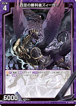
From left to right (or top to bottom), "Quadruped Victor, Sieger" in the original frame layout, Set 13 frame layout, and Set 36 frame layout.